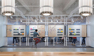
I was perusing through an old edition of Contract Magazine (May 2015), and came across a profile it did on the new floor design of Uber Technologies in San Fransisco. The up-and-coming company had an existing headquarters in a building on the 4th floor, but due to its popularity and growth, Uber expanded, leasing the 11th floor in the same building. This floor was to have a variety of great spaces for collaboration, with a refined definition of the scrappy vibe that comes with start up cultures. As said by the principal at Studio O+A (designer of the project), is was a "more rebellious cousin of the Uber headquarters (4th floor). We wanted this to feel like a start up but in an elevated and refined way."
 The idea of "start up company" or "start up culture" has been very prevalent in commercial design the past few years. It is a notion that all the walls and private offices seen in past corporate designs aren't desired anymore by employees (and sometimes employers), and people want to connect on a closer level. This same concept is being used in residential design as well: everyone wants the open concept feel. You want to be able to drift from the kitchen, to the living room, to the dining room, so that everyone can feel connected, and you can better communicate without barriers. Well, same goes for office design. The amount of space is not important, but it is what you do with it that counts. When you are in a job that requires constant collaboration, it is much more enjoyable to have an open floor plan injected with a variety of spaces to accomplish the projects and tasks at hand. I think it is hard for people outside of the design industry to understand how their work environment can affect their efficiency, effectiveness, and overall well-being. The new Uber office achieved this (with positive employee feedback) by having a balanced floor plan of open workstations, semi-private and private collaboration spaces, multi-person studios, and a large "cave" in the middle.
 The idea of "start up company" or "start up culture" has been very prevalent in commercial design the past few years. It is a notion that all the walls and private offices seen in past corporate designs aren't desired anymore by employees (and sometimes employers), and people want to connect on a closer level. This same concept is being used in residential design as well: everyone wants the open concept feel. You want to be able to drift from the kitchen, to the living room, to the dining room, so that everyone can feel connected, and you can better communicate without barriers. Well, same goes for office design. The amount of space is not important, but it is what you do with it that counts. When you are in a job that requires constant collaboration, it is much more enjoyable to have an open floor plan injected with a variety of spaces to accomplish the projects and tasks at hand. I think it is hard for people outside of the design industry to understand how their work environment can affect their efficiency, effectiveness, and overall well-being. The new Uber office achieved this (with positive employee feedback) by having a balanced floor plan of open workstations, semi-private and private collaboration spaces, multi-person studios, and a large "cave" in the middle.
In addition to the overall space planning of the floor, another aspect that brings in a "refined start up" feel is the use of materials. Exposed ceilings and raw concrete are common traits of industrial design that coincides with that rugged start up feel, but Uber and Studio O+A took it one step further. They incorporated custom light fixtures with chains and recycled materials, butcher block table tops, and left drywall unpainted. Pairing these "bare bone" characteristics with sophisticated furniture and modern graphics/branding on the walls makes this design a homerun in my book. They have provided a space for their employees to effectively collaborate and have a balanced work life, while also separating themselves from the competition with a completely unique space for them.
THAT is why I love design. An office that makes you feel connected, motivated, and a part of something bigger than yourself. A classroom that encourages innovation and creativity. A hospital that promotes healing and serenity.
What does your workplace do for you? Does it build you up to be a better you, or leave you wanting more? The answer may just be in the design.
Much love,
Tracy


0 comments